Material/Technique/ Process Name:
Pencil
Variations or types i.e. 2B 2H
pencil or shape/motion tweening:
HB pencil , coloured pencil
How do you use the material/ Step by
step instructions for technique or process?:
You use the material by placing the Pencil on top of the
paper and then move it about on a piece of paper.
Relevant dimensions or constraints:
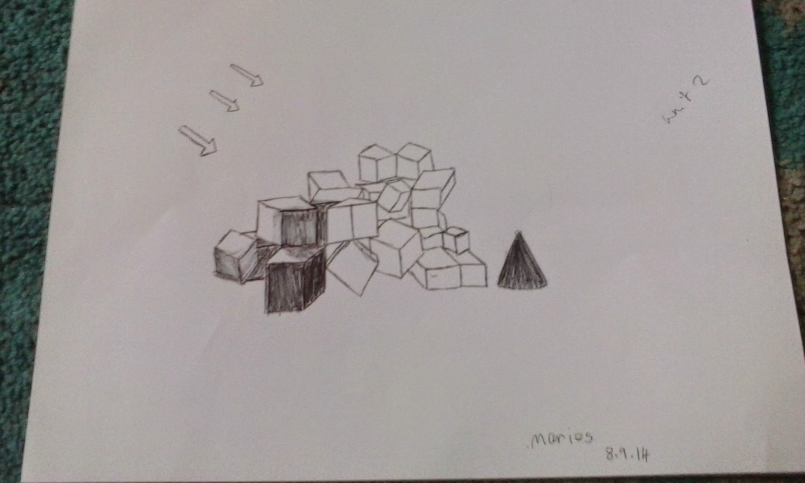
Cylinder joined to a
cone
Linked techniques:
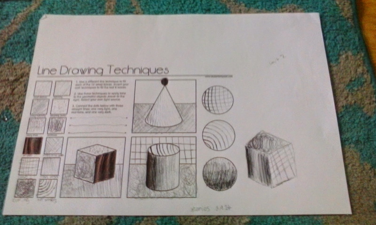
The uses of a Pen, Cross-hatching, short dashes and wavy
lines
Health and Safety issues related to
Material, Technique or Process:
Do not hold the pen in a way to hurt others, do not eat it,
do not stab yourself with a pencil.
Evaluation:
Evaluation:
Using a pencil is something im ok with but I prefer to use a
computer with programs to do my work or the use of a pen. What I liked about the Pencil is that I can always rub out my mistakes when I make one so I can try to make my work look nice and presentable. What I dont like about the pencil is that I find that I break pencils too easily and there for use a lot of time sharping them. If I had to use a pencil again and most likely I will, I make sure that I take my time with it and do not rush the work itself. One technique that I used is the cross hatching and one thing I like about this technique is the fact that it really gives depth to the work that im doing but the one thing I dont like about it is if I mess up cross hatching it will look really bad and messy in a bad way.
Material/Technique/ Process Name:
Pen
Variations or types i.e. 2B 2H
pencil or shape/motion tweening:
Gel Pens, Glitter Pens, All the colours of Pens, Ball point
Pens, Coil and Quill Pens.
How do you use the material/ Step by
step instructions for technique or process?:
You use the material by placing the Pen on top of the paper
and then move it about on a piece of paper.
Relevant dimensions or constraints:
Cylinder joined to a
cone
Linked techniques:
Health and Safety issues related to
Material, Technique or Process:
Do not hold the pen in a way to hurt others, do not drink
the ink, do not stab yourself with a pen.
Evaluation:
 I found that using a Pen is more useful then I though it
would be and will use this again for my future work. What I liked about the Pen is that I can use it for more textures and create better effects. What I disliked about the Pen is that I cannot rub it out what so ever so if I made a mistake I have to live with that mistake but sometimes a mistake could give me a idea to make the work better. If I had to use the Pen again ill try to be more soft on the parts that was ment to be soft so the shading can look better. One of the techniques I used in my work is stippling or in other words, dotting. One thing I like about dotting is i found it useful for when I need to make the work look light But the one thing I dislike about it is that it can look childish if done wrong.
I found that using a Pen is more useful then I though it
would be and will use this again for my future work. What I liked about the Pen is that I can use it for more textures and create better effects. What I disliked about the Pen is that I cannot rub it out what so ever so if I made a mistake I have to live with that mistake but sometimes a mistake could give me a idea to make the work better. If I had to use the Pen again ill try to be more soft on the parts that was ment to be soft so the shading can look better. One of the techniques I used in my work is stippling or in other words, dotting. One thing I like about dotting is i found it useful for when I need to make the work look light But the one thing I dislike about it is that it can look childish if done wrong.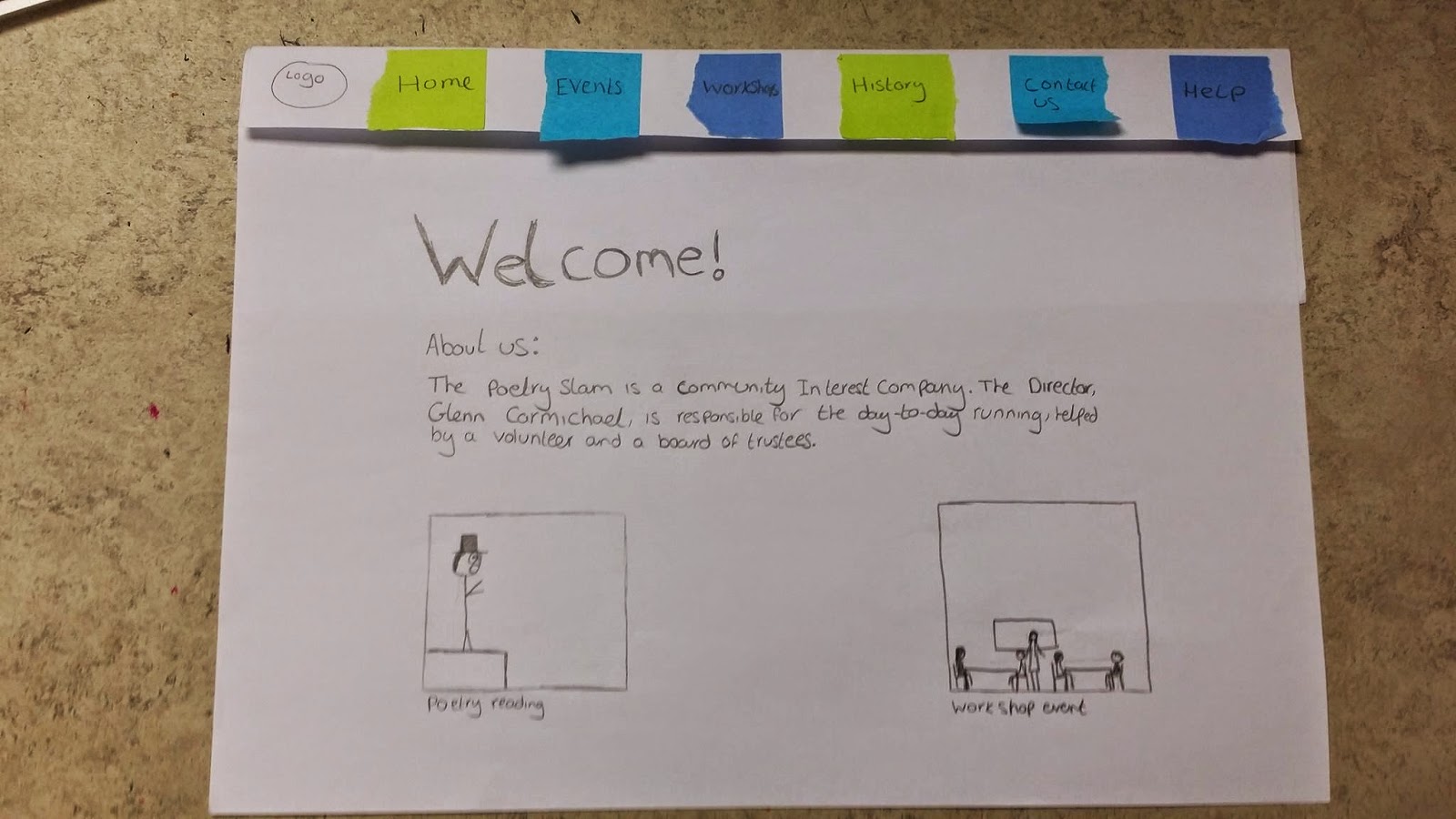
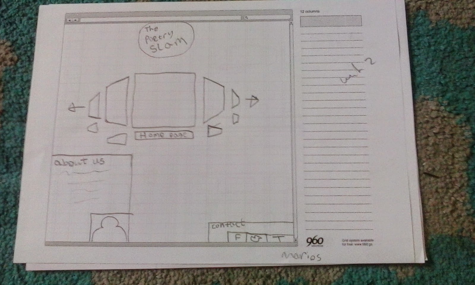
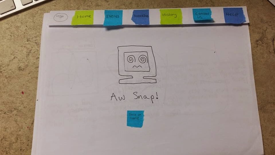 This work is for Paper Prototyping and Thumbnail Drawing, what I and a group of other students has done is a paper prototype of what the website "Poetry Slam" should look like, which includes links, buttons that works like a website. Both me and the group feel like that this was quite a big success and not a lot really really needs a change, one thing I might change is the layout of some of the work, I dont like it that much and I wish we had the time to give it some colour to show the work abit more. This work also did not so long to do being in a group that was able to decuss a lot better then most groups. When it was tested to see if there was any problems, it did surprisingly well with most of the questions being answered done in a slow but done way. I would most likely use this again if i need to design a idea before going head first into a project.


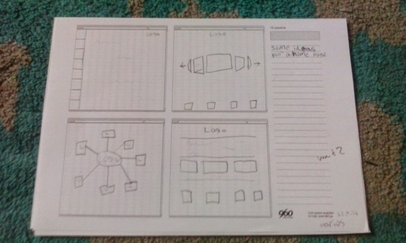
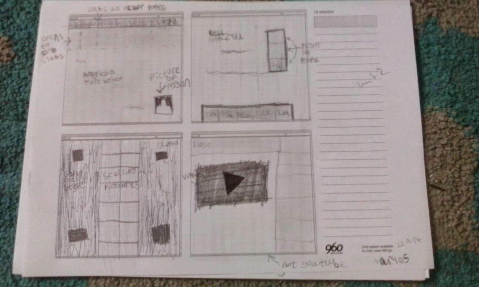
 This work is for developing thumbnails with web grids. What I did is giving a range of design ideas for the website "Poetry Slam."I think that the range of media that I have used is very lacking and wish I had used a pen or coloured pencils to give my ideas more life to them. While most of my ideas are just line, I have put some shading and tone in to give my work some life and I can see that giving it shading and ton really makes the work look better. This work did not take me very long because it was mostly just about getting ideas down more than trying to make the work look neat and nice. I do feel like that this was a good way to jot down as many ideas as you can so starting to make a website would be easier for myself. I would use this way of working again in my future to help me get good ideas of what i need to do for the work in the first place.
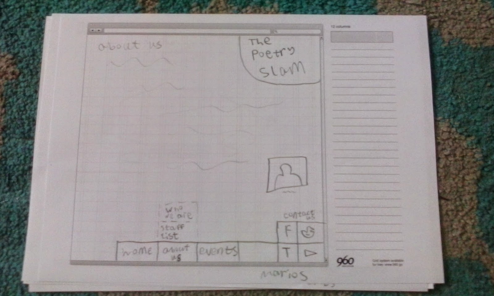

This is the seamless texture practice. What I had to do is use photo-shop to create a texture that seems like it can go on forever to place in the back-ground of a webpage. What I like about this work is that on my first try i almost got the work right without making too many mistakes but what i didn't like about my work is that I accidentally created this unrealistic "lines" in middle of the page.

(I have not used these textures because I wanted to keep it more simple)
This is my second seamless texture practice. What I like about what I did here is it is much better then my last work because the line seems to have disappeared but the thing I dont like about it is that I made some of the stones look "uncanny" and I have used a stone one too many times for people to see it in my work.

This is where I got to within 30 minutes of the template for the poetry slam site I am creating with the use of the 960 grid. The work was going pretty slow for me because I was still "rusty" with photoshop and needed to get use to photoshop again. What I like about what I have done is the colours that im using and how close I am to the paper sketch up but what I dont like about this work is that I am behind on work and must work faster. I feel like this is very early into the site development and will need a lot more work. 
This is the template for the poetry after more time has been put into it. I have been paying close attention to using the C.R.A.P system within my work. The one thing I like about my work is like me before the colours and how close I am to the paper sketch. What I dont like about my work is that at the moment there is no words what so ever. I have done all most all of the visual work but I have not started putting in any text and I will need to do that at some time.

This is my finished outcome of the Poetry Slam website. I made this with soft colours in mind to represent the elegant part of the Poetry Slam website. What I like about it is that the menu is different from many other websites that use the same stranded buttons on top of the web page and instead used a more interactive way of menu control. What I dont like about it is that the background is only white and lacks some creativeness. If I had the chance to improve my work I would give it a nice background.

These are a bunch of random doodles and placed together using photoshop, this is a mixed media between the use of pencil and digital media.
What I like about this work is the use of creating something a bit abstract out of nothing but a few random doodles and the use of photoshop.
When I finish this work Ill give it colour which will be the thing I would like to improve in this work.


These are my doodles that has been changed by photoshop. The media that I have used for this work is a mixed media between pencil and photoshop.
What I like about this work is the textures I have used to create these different looking shapes.
The thing I can do to improve this work is maybe do more works of different colours because most of them seems to be red thus giving a bit of limit to the work.

This is my coloured version, using photoshop, of my random doodles that I made into a picture using photoshop.
What I like about this work is the use of creating something a bit abstract out of nothing but a few random doodles and the use of photoshop.
If I could improve my work I would try giving the shapes a sense of them being together using similar colours or textures to give them all A area feel.


These are many edited of used doodles . I first did this by using pencil, then scanned the work in using a scanner then edited the work using photoshop.
The things I like about this work is how most of the texture is made by using a few simple photoshop methods.
What I would change about this work is to give more colours to the work that I have done to the work.
If I kept adding these shapes together and placing them in more random places, it would look a bit like

This is my final work for my showcase on creating new ways to use art. The media's I have used for this is using pencil to make the scribbles for shape then edited all of it in both photoshop and illustrator. What I really like about this work is how strange and odd this work is I feel like that it all just works with each other very well with each other. If I should improve this I would give more of a background to give the work more of a strange feeling and intrest in the world itself.
No comments:
Post a Comment