Friday, 15 April 2016

Unit 66 Digital Video Production for Interactive Media

This is my Showreel

Chroma Crisis - A Splatoon Fight


This project is overall a pretty good interpretation of the game it came from, it kept the same ink based game play and changed it up enough to keep it a parody of the game in a way but does make its own thing using only a few things on the game. I feel like the project was not filmed in the way the game would of been filmed if it was a movie itself, but the effects like ink, or paint in this case and when one of the actors gets smacked into the sky is quite familiar to anyone that plays this game.  I for one do not see a problem of this project getting on YouTube, Vimeo or Daily Motion the worse I can see is MAYBE the guns making it not playable in some countries but thats VERY nit-picky, the file format will most likely not stop the project from getting on the websites, this is a 3 minute project so therefor there will not be a size problem.


Rust in a nutshell


Overall this project is really effective because of how close it resembles the games quirks and mechanics to the player by film. At some parts of the film, it toke a 3rd person perspective which is a option in the game to play in 3rd person. There is quite a lot of editing in the game like the use of making menus that float in real life and making rocks break every 4 hits, these little details makes it  make the project much better by making it very clear that the game is being researched and looked at for the animation. I for one do not see a problem of this getting on YouTube, Vimeo or Daily Motion the worse I can see is MAYBE the guns making it not playable in some countries but thats nit-picky of me. The file format that was used for this video did not stop it from getting on YouTube. This is a minute and a half video so therefor size will not be a problem as well.

Skyrim Badass


Overall this project shows off the game its portraying very effectively in the perspective of the player who likes to take on the world. The whole project is filmed in first person, which is the main camera that is used in Skyrim. This game is packed full of everything to do with Skyrim like dragons and WhiteRun guards transporting a prisoner to another jail, all that detail really makes it so the project based on this game feels right. This project is under 2 minute so I don't really see a size issue for this project. To keep the project to look this clean, you have to compress the project which might make a problem with making the file format wrong but thats easily fixable.

REAL MORTAL KOMBAT - Video Game Flaws (MK Parody)


Overall this project does its job of parodying Mortal Kombat very well but still keeps it focus around the games quirks and short sightings. The camera is always pointed to the two players with one on each side like the game itself and the effects are gory as well with the actors trying to recapture the short looping animations thats get used in Mortal Kombat. The file format would have to be of quality for the effect to still look good so that could also cause some size issues when it comes to YouTube for its not as unlimited as Vimeo and Daily Motion so they might of been better sites for the video.

Sentry Sabotage! TF2 Live-Action


Overall this project recreates a online match in TF2 quite well. The filming of this is normally a far away shot like you are watching the action happening other then being in the match which does make it a tiny bit less about how close it is to the game but the effects are really good and looks like it is the game itself being played out. This project is about 1-2 minutes long but has a lot of stuff going onscreen so it might of been a really big file size and a odd file format but I don't that any of the websites would care just as long as you spend a bit of time uploading.


overall this films trailer is a spectacle and for mostly the right reasons, It was filmed in a huge variety like close and far shots and move shots. It really feels like the movie has a unimaginable scope and insane detail. To let this get on any video sharing website, they would have to of down size the screen quality if they wanted people to see the trailer to the movie.

How effective was the overall project, how was it filmed and edited it look and/or feel like the game they are recreating. What problems would this animation would face getting on YouTube, Vimeo and Daily Motion. (file format and size)


BTEC Interactive Design Project Proposal Document

Project Introduction

I want to re-edited some of the cutscenes of the zelda CDI games with myself inserted into the game in any role, whatever part I wanna re-edited is the idea for Digital Video Production.  

Constraints of the project

Must be 2 minutes of footage of what I wanna re-edited with one minute of live action filming that I have to be in, I have a lack of costumes to be in character in properly. It must work as a video at the end of this project, it cannot be too big of a file as it might make it so I can't upload to certain sites. I need to remember the lines to a T as i'm trying to re-create the lines with me in it.

Context of the project

The research that I have done above gives good examples of solutions to the design problem which also ties in to professional outcomes as some of the research I have done is about professional work. The contextual references are in the research as well. 

Initial Ideas for the project

Some of my Initial Ideas that came to mind are Zelda CDI, Splatoon, Avatar, Prototype and a David Attenborough commentary.

Target market

My Target market is the people that likes bad video games in a way that they can have a good laugh it. It can be also be a target to people that likes videos of difference techniques making something really fun to watch.

Deliverables

Investigate brief

Research the animations and recordings.
Find the idea that I would like to do.
Find out how I would do this and what is the best way to do it.

Generate ideas

Mind map what I can do and cant do.
Refine the idea by knowing what part I should and when it happens.
Make a quick story board on the parts I am doing.

Develop ideas

Find and download the clips and cut off the parts I don't need.
Edited around the clips to make sure it looks professional.
Refine the story board to include camera shots and angles.

Produce outcome

Get the right equipment ready.
Shoot the final clips.
Edited the clips with the shoot.


Evaluate Outcome/ Prototype or Solution to problem

Show people the clip and get comments.
Evaluate what I could of done better.
Put it up on YouTube for people to see

Evaluation Methods

Showing students in my course the final work and then placing it on YouTube for people to see.


This is my mind map for ideas of games or other media that I could do for the main outcome


This is a expand version with the game I have chosen for the final outcome.

Chopped off part: "One of these would be good"
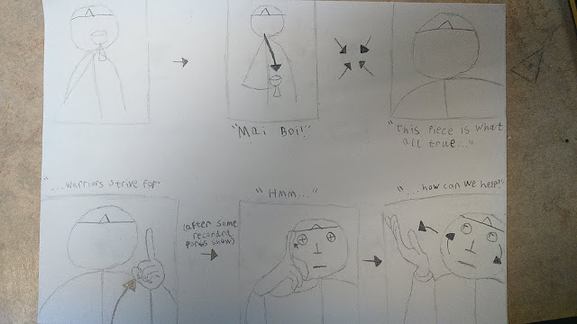


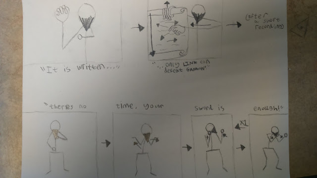
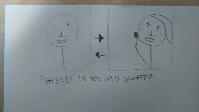
These are a few examples of acting that I will do in my live action part of the 3 minutes video.


these are the parts that I will act out of the three minutes of video. All this acting is 1 minute and 20 seconds so I might need to cut out one or two scenes.


This is my final work for Unit 66.

W: The video is cut and stitched together very well. background noise is a problem
S: Very comedic. The story isn't very easy to understand and i didn't always get which character you were playing as.

L: Replicated the original to great standard. Well developed and thought about. Could of thought about lighting depending on the current frame in the view.

M: The acting of the final outcome was well done and had a seamless editing in between acting and animation, but we had problems of knowing who you are acting, maybe props could help you to show who you was playing as.

J: The acting of the final outcome was well done and had a seamless editing in between acting and animation, but we had problems of knowing who you are acting, maybe props could help you to show who you was playing as. Clothing is another way you could of made it easier to see who you was acting at the time. Voice acting did help only a little bit.

So in conclusion My video was edited well and was seamless, it had comedic value and was acted very well. The main problem I had was getting people to understand what character I was playing as at the time. I should of had clothes on for certain people and props to help out people on who I was acting on at the time, voice acting only helped out a little bit.

Wednesday, 16 March 2016

Unit 6 Application, Exploration and Realisation in Art and Design

Project Introduction:

To create a 2.5d beat'em up genre of game. Some of the problems that I might run into are coding, as I am not sure on how to make a game like this in code from like how to get hits to register or health bars to work to way they should.

Constraints of the project:

The project must be interactive. This needs to work on PC and Mac is functional to the point of it showing what I would of like the gameplay to be. I need to keep the models and graphics as simple as I can to get the core gameplay out and refined as much as I can.


Context of the project:

Castle Crashers: Flashy beat'em up with fast moves

Streets of Rage: Beat'em up with fast moves

Devil May Cry: 3D spectacle fighter with fast flashy moves

Golden Axe: 2D fighter with difference combos for difference outcomes

Bayonetta: 3D spectacle fighter with fast flashy moves


Initial Ideas for the project:

A simple game where you can hit things and there health bars go down and once its to 0, they fall over, simple combo's that I can do maybe. SCORE. I'm making this game quite a fast pace to keep the flow of the game pretty well with semi weak enemies.


Deliverables, Targets and Milestones:

 Specify a list of objects or tasks you will do to complete the project i.e. what typography, colour scheme, process, materials, techniques, provide paper/wireframe/working prototype etc.
16th March (Unit 06 Brief issued) : Proposal
24th March Proposal document to be presented for approval : Finish Proposal
28th March Easter break 1 : Research
4th April Easter break 2 : Research
13th of April : Research/Coding
20th April : Coding
27th April : Level Design
4th May : Character Design
11th May : Character Design
18th of May : Texture Work
26th May : Modeling
30th of May (Whitsun holiday week) : Modeling (Animation)
8th of June : Bug fixes
16th June (Deadline for Unit 06 Final Major Project) : Feedback

Evaluation Methods:

End of year show, comments with other students and people who will see my work and give feedback as well. This will show that I have listened to more than one type of person and has got feedback from people with difference perceptive.


the game is somewhat limited to make sure I make the game on time

Any game and be limited or open worlds, that will depend on the developer constraints.

single-player game

Animation 

3D models

A.I

UI (menu, health bar)

SCORE


Golden Axe arcade

I have chosen this game as a influence because it matches up the kind of gameplay that I want to have for my final project. The games combat system seems quite simple and fun to play with a few added things on it to keep the game fresh like mounts and magic that you get within the level itself. The animations of this game works to make sure that you see the impact of hits when you connect your target or you miss your target. Graphics of this game works for its time as this game is quite old, it uses difference colours to tell you the difficulty of the enemies.The music of the game sounds adventurous, the sounds feels like it has a impact to each punch and kick plus the sounds all are distinct from each other from the picking up an item to hoping on a mount. The one thing I should take from this game is its simple and quick output of melee attacks and its item system.


Alien Storm (MegaDrive)


This game is a influence to me because of its fast beat'em up gameplay and its odd mid level parts like running at the speed of sound firing at aliens. The combat of this game is quick with quick movements and quick attacks, the slower heavy attacks takes less then a second to pull off. The animations of this game takes less then a second to pull off and makes the flow of the game faster because of it. The graphics of this game is old but works as well. The colours of the game pops out for anything on the foreground while the background is mostly browns and greys. The music is serviceable while the sound is quite repetitive. If I have to take something from this game, I would take the fast combat.

Double Dragon Arcade
This game is a influence to me because of its VERY simple story that takes 5 seconds to convey and the good use of animations. The games combat is pretty fast with quite stiff animations to make the combat seem heavier then usual. The animations of the game is very fluid for its age and it works well to show what part of the body you are hitting. The graphics is old but serviceable for its time. The colours are a bit bland for the most part, but it does have difference colours for enemy difficulty. Music is up beat and gets you ready to fight while the sounds are impactful and it sounds like you are punching someone. If I have to take something from this game, its that to keep the story VERY short and at the beginning.
Devil May Cry
This game is a influence to me because of its fast and flashy combat and its art style. The combat of this game has a huge variety of combos and ways to get rid of the enemies. The animation is very fluid and is very flashy to the point of it looking very cool. The graphics of the game works for its art style as in its very grunge and dark which makes it so the graphics don't have to put too much work into creating this world. The colours are mostly browns and greys but with key things like the main characters and the enemies so you don't lose track of yourself when you are fighting them. The music in the game is mostly atmospheric until you get into combat it becomes more heavy metal/grunge to suit the mood of the art style and graphics. The sound of this game is loud and distinct to what it should be, example being, when firing the guns, they sound very impactful and violent. If I have to take anything from this game is that to make the moves look flashy and fast to make the player look good, even though they are only pressing a few buttons.


Bayonetta
(Skip to around 17 minutes)
This game is a influence to me because of its fast and flashy combat. The combat of the game fluid, fast and flashy with a huge variety of moves to beat up some angels. The animations are fluid when making combos, it is also quick to move from one animation to another with a single button press. Graphics is decent with pretty good models to create the world well. The colours in this game are mostly greys and browns in the background with the bright and light enemies to easily see who is what. The music is upbeat and catchy to grab the attention of the player and the sound design its very impactful with a lot of flare within it. If I have to take anything from this game, it would be to make the action look as appealing as I can


Castle Crashers
This game influence because of its colourful and simple art style. The combat is a fast two button masher with jumping to create other combos. the animation is simple and fluid to make sure the combat flows well and quick. The graphics are simple and needed to be simple so there is not too much on the screen to detract you. The colours are all over the place and is a pleasing site. The music in the game is upbeat and catchy. The sounds are heavy and loud with a lot of impact to it all. If I have to take anything from this game, it would be the colourful and simple art design that makes the game easy on the eyes.


This is my mood board on health bars. These health bars consist of lines, normally from right to left, most of them are green but there are other colours being used for health bars like red and even some that have more then one colour or makes a transition from one colour to the next to help show where the health bar is at. I should make the bar of my health bar easy to see and east to know whats full and whats empty.


I started by playing around in photoshop and made a texture that is above the health bar I have made, I was thinking on either making the bar a line or give it a curve on each side.


I have made it curve because I wanted to make the player know that it is the players health bar by placing this under them at the start of the game.


after some edited like the main character's (?) face and the numbers that shows how hurt you are, I have done this for another way to show some one being hurt.

I was thinking of using textures for environment and no textures for characters to let you see the characters and enemy easier. This is because of the time constraints that was given to the brief and I needed to get a prototype working before the deadline. It is also because I wanted the art style of both complex and simple together in a strange way.


When importing my player model, I had this problem of only some of the textures showing up, so to fix this I made sure that every bit of patten was done in one selection, I do not know why this worked but it did. 


After using the textures, i have noticed that the textures themselves are very stretched and in poor quality so i have taken the picture to photoshop.


This is the original picture, as you can see the picture is not seamless so with some an hour of photo shopping.


I have made the picture seamless and able to pasted them side by side.


This is the picture with the stretched texture, its not the best looking so I wanted to change this.


So the new texture comes on and is placed side by side of each other to make it seem less stretched.


With the new textures that are on the level, it looks more polished and easier on the eyes which in turn looks nicer and more professional. 

This animation is the attacking animation for when hitting an enemy, its slow but can work still as i can increase its speed in unity. This suffers from clipping issues but you cant normally see that in game.

This is the idle animation for the character, I like this animation because it shows he is inpatient and ready to get going, one thing I would change from the animation is the face that his head might be moving too much to make it slightly unnatural.  

This is the walking animation for the character. This animation is slow but can work still as i can increase its speed in unity.


This animation had to be re-weighted for death animation, there was a problem with weighting the body and had to be redone to use all of the body movement.


This GIF has inspired me to create a simple beat'em up as it shows good animation to show kicks and punchs with varying speeds.


I have recently made this health pick-up as a way to make the game a bit more easier and is a small reward for doing well.


It started as a few cubes in 4D, then I gave it a light green material. I have made it look like a plus as its normally a positive and its a sign of medics and healing within games. I have tilted it back a bit and found code to rotate it to make it easy to see over other things like enemy and the player.


This is the video for my final work on unit 6

Evaluation: After a long time of doing my project I have learned that if a idea is too hard or annoying is to redo that part again or find another way around. I need to work to my strength more and find a more simple way to do the harder tasks. Plus if I get stuck on something hard, I should do something else instead.   

Friday, 5 February 2016

Work Based Learning

Gone to the Game Jam and learned that the project is about "rituals"


  • Made some ideas of level design, objects that are needed, story and game play with co-worker
  • Made some objects within Blender (never again)
  • Made Title font and small bits of code and sent it to co-worker
  • we did not make it on time atfer doing as much work as we can
  • we failed
We should of maybe cut back on the ideas and do them within the time limit next time we go

Friday, 11 December 2015

My Portfolio

Year 2 Unit 45 Graphic Image Making


This is some of the ideas for graphic image making. 


This was one of the ideas that was mocked up on paper


This was another idea that was mocked up on paper


This is a story board for a short animation for one of my mocked up ideas

https://www.youtube.com/channel/UCsXVk37bltHxD1rDPwtNM8Q

This a channel that uses infographic as its style to convey its message, the messages that are normally on this channel is scientific discoveries and facts about real world issues.


This is one of the examples of the youtube channels infographic art being put to use by showing what the person is talking about, as this person is speaking, the infographic changes and represent itself by making it relevant to what he is saying. I do like the topics that this is trying to get across but I don't like the music that plays in the background is sometimes misplaced.


This is "The Power of Food" infographic on youtube, it has someone talking in the background while a animation plays to represent what this person is saying, it has a simple and bold art style that gets the point across. I do like the images made to get the point across but I don't like how uninteresting the topic is.


This is a infographic about Indonesia, unlike the other animated infographics I have talked about, this one remains quiet in the senses of only music is playing in the background to let the image talk for itself. I do like that the video is quiet and lets the video do the talking but I do feel like that the video would have more info if someone was talking in the background.


This is a infographic about growing up, unlike the other animations I have talked about, this one has this sketchy art style with paper craft on top of it. I love this art style a lot and hope to see more like this, I just wish the infographic was talking about something else.


This is a infographic of contraception awareness, this poster talks about the positives of contraception. It shows the positives by using pie chats and a symbol of a women to help convey the information to the reader. It uses the pie charts and the symbol to help catch the potential readers attention and inform them about the positives of contraception. The women in the middle is a quick and easy way to convey simple information to someone by giving a quick blue to red ratio on people who use contraception and people who don't.


This is a infographic on how the reader can be more earth friendly. The infographic shows a list of information on how to be more earth friendly. The images shows what is relevant and will back up the words themselves like a light bulb if it talks about a light bulb and saving water would be a picture of a tap. What I think works about this work is how blunt the text is and easily digested it is to read. What I think this work does not work so well with is the colouring of the work seems to be not green enough to make it look like its being earth friendly.


This infographic is on facts and awareness of the octopuses. The information on this infographic is about random facts like how many species they are and how much of them is made out of muscle. The images are used to give more context to the words themselves like saying the octopuses has three hearts and having a picture of three hearts on top of it. The colours of the infographic are both bold and contrasting from the two main colours because octopus are mostly know to be red and the sea is blue and therefor is more of a contrast. 


This infographic is a template for people to learn and adapt your own infographic from it. This infographic has template art, graphs and words for you to easily see what you can replace with your own things. The colours of this infographic is basic and functional for its purpose because it is a template and can be changed to what you would want it to look like. I think it might not be the easiest thing to use because it would be hard to remove half of this infographic to replace with your own things because you might as well create your own with the amount of time and effort you would put in to changing everything around with this infographic.


This infographic is about the the market place that is around us more then we think it is.
The information on this infographic is about the market on social media .
 The images are used to give context to the words of the infographic and to give data as well. 
The colours are bold and only keeps to three to four colours to keep things simple, unless its the symbols of the website themselves. 


This is Saul Bass' work of "Anatomy of a murder" this may influence my own information graphic by making it only one or two colour to try to keep things simple and I don't need to make my work look perfect as it can be an art style within itself.


This is "SAVE THE ARCTIC" by Mauro Gatti, this may influence my own information graphic by giving my work soft colours to make things look pleasing and to be clever with my art skills as that can keep a viewer watching.

 Design Project Proposal

Project Introduction

To create a A3 infographic sheet and a animation on a infographic of my own interest. I will research into both infographic and artists of infographics, develop the ideas from the research into ideas generation then with the ideas ill take into Ideas Development and pick my best one to produce a final outcome.

Context of the project

See research where I talk about difference infographic and infographic animations.

Constraints of the project

My animation MUST be 30 seconds, no higher, no lower, my animation MUST be a infographic and must give facts out as a result.

Initial Ideas for the project

My initial ideas for this project are to start brain storming anything I might of been able to turn into a infographic and then narrow down to a few ideas and placed in my blog

Deliverables

I will use flash, illustrator and photoshop to create my work. 

Targets and Milestones List
Investigate brief

Research into ideas.

Research into infographics.

Research into artists that has done this work before.
 Generate ideas

talk about the ideas that I have thought of and say why or why not the idea would suit this project

Produce a mind map.

Produce a mood board.

Produce research into your chosen theme and gather statistics (info on the game), to support the development your own information graphics.

Develop ideas
 3 design concept sketchs of infographic

redo one of the concept with more typefaces and colour

do it again to a much better detail

Produce outcome
 Document the process of creating your information graphics. Write regular annotations outlining this process using the right words

Create an information graphic A3 sized poster, based upon the theme set out in your proposal. Print and post to blog.

Create a 30 seconds information graphic animation; based upon theme/style/data, of A3 poster. Post to blog.

Evaluate Outcome/ Prototype or Solution to problem
Comments on audience responses to your animation.

Final evaluation about the process of developing your information graphic


Ideas

Smite


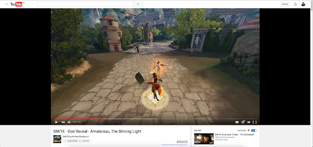
This was the video that gave me an idea of doing some facts about the game smite and its developer Hi-Rez, might do some random facts about gods or changes that needed to be made.

Splatoon


This is one of my highly loved games and i'm thinking of doing an infographic of facts and info about this game itself, I can talk about things like within its beta stages, the squids was bunnies but was changed when the other workers at Nintendo was confused on why bunnies would be the ones the throw ink around the place was then was changed to squids.

General games


Instead of doing a whole project on one game, i can do more then one game or maybe one company like SEGA or CAPCOM. This would let me be more loose on what I can talk about but this might make it so ill loose focus on what I wanna pinpoint on what to talk about.

Ice caps


I can be a normal human being for once and do something normal like the ice caps and some facts about recycling and how we can save the earth or something like that. The facts could be easier to be found on the net and it might be helpful to people who don't know about about this kind of stuff but there are so many of this kind of infographics on the net and i'm not really interested in it.

Japanese culture


A infographic about the Japanese culture would be fun to do about, bringing a culture into a infographic could be interesting but i have no idea how where I would get information from.


This is a mood board of ideas that I might use in the infographic.


This is a mood board of the theme of my animation, I want to use silhouettes to try to keep the animation simple and effective.


This is the mood board of possible colours in my animation, I want to keep the bold colours that are seen within Splatoon itself.

facts and stats about splatoon

was going to be a Mario game if no one else could think of a idea for the game itself.

a secret collectable in this game conforms that this game takes place 12,000 years after humans was alive.

squid sisters Callie and Marie said fast enough is calimari, a squid dish

inkling girl was made first and then the inkling boy was made in comparison to the inkling girl.

in polls about Splatoon in japan, 75% of the people who play Splatoon plays as the inkling girl. 

the game idea was made far before the design that only blocks with smaller blocks as guns was made, they was called "tofu with noses" later in the games design cycle the players became rabbits for a bit, the design was that the white fur on the rabbit would show damage while the ears would show where the player was facing, but when showing it to other employees they was confused on why rabbits was shooting ink, the next design was squids with legs then designed to the inklings used in game.

https://www.youtube.com/watch?v=eCQOGuY9YLQ

https://www.youtube.com/watch?v=F5r2lvDaj7M

Ideas Development


This is my first idea for my Splatoon infographic animation, it is a picture of the main characters face and "hair" with the facts where the rest of the body should be. The thing I like about this work is the main character can well detailed if done right but what I don't like is the fact that I have no clue how to animate this in a infographic way.


This is my second idea for my Splatoon infographic, it is a bunch of squids swimming around in ink while facts follow behind them. What I like about this work is that it would be easy to create a infographic with this idea in mind but the negative on this is it could be a bit on the boring side if not done right.


This is my third idea for the Splatoon infographic, It starts with the first design of Splatoon and then it goes to Mario when the team cant think of a idea and Miyamoto tells the team to use Mario if they cant think of an idea, then a bunny for the next fact and then a squid when the final design comes out. What I like about this is that I can use the art to give direction to the facts and make it easier to follow because of it. What I don't like about it is I can really change much of it if the idea does not come out well so ill have to make sure if picking this idea, I do everything right first time.


This is the start of my A3 Infographic, This is the basics at the moment and needs to be changed around to make it look better.

First thing I did was to change text around to make the text boxes seem more equal, as a result it looks like a bit more thought was place into the picture before it even has any work done to it.


I gave the background a orange colour to contrast from the text to the background more.


I have made the text darker blue to make it stand out more from the background.


Trying to keep more into the theme of Splatoon, I have placed splats under the text itself.


With the splats being in the background I have got rid of the orange background and gave the facts and splats difference colours to show off more of what the game is about.


Then I added a new easy to the eyes background on the infographic to make the background a bit less boring.


Finally I move the black and white characters up and down a bit to get rid of a tiny bit of white space and to make it look more lively.


I needed more visual interest in the background, so I did buildings that looks a lot like Splatoon's town called inkopolis and made it grey to make sure it can be seen but not make everything else not be seen.


This is my storyboard for the animation.

final work

https://www.youtube.com/watch?v=eR0VMXEX1UI&feature=youtu.be